Client
Shell
Role
UI Design • Prototyping • Animation
Shell Design System
Overview
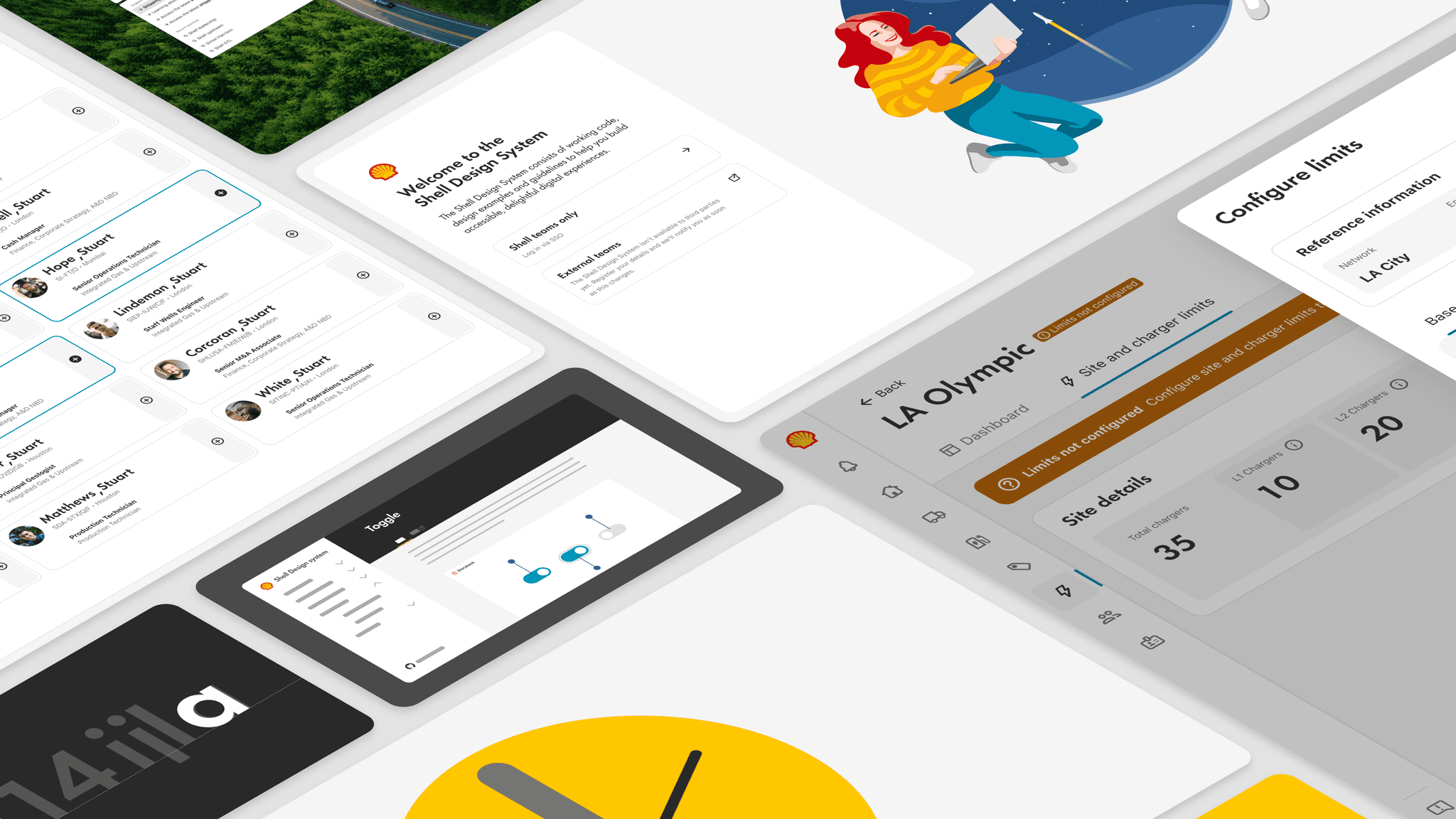
One of the most significant projects I worked on at Shell was the Shell Design System. Early on, we realized that Shell had several other 'design systems,' each at different stages of development. Some were more aligned with the brand but lacked a comprehensive set of components and code, while others were loosely based on open-source UI kits that didn't fully reflect Shell's brand identity.
This made it evident that Shell needed a robust, enterprise-class design system that would not only meet the current needs of the business but also support its future growth.
Design
As a lead product designer, I was involved from the early stages in shaping the look and feel of the Shell Design System (SDS) documentation site. I also worked on UI component updates, pattern design, and documentation.
Like many design systems, our components page featured a live code playground, allowing developers and designers to fully grasp how each component functions and explore available variants. At Shell, this level of detailed documentation was groundbreaking, enabling product teams to develop their solutions at an unprecedented speed.
SDS Foundations
The Shell Design System provides a comprehensive set of over 40 components, built in both Figma and React, that have been rigorously tested for accessibility. The team put in significant effort to structure the Shell colour palette to meet WCAG AA 2.2 accessibility standards right out of the box.
By utilizing Figma variables and modes, the SDS color theme ensures that designers can only use specific colour combinations in the appropriate contexts.
The colour theme, known as 'Fabric' in the Shell Design System (SDS), was developed with significant contributions from the design team. Figma variables and modes were implemented to ensure that designers adhered to brand guidelines and maintained accessibility by preventing the use of off-brand or non-accessible colours in the UI.
This approach significantly reduced complexity for designers, allowing them to focus on creating their products without the added burden of constantly checking for brand or accessibility compliance.
One of the key innovations the Shell Design System (SDS) introduced was a consistent icon design style. Collaborating with the brand team and following industry best practices, SDS provided a well-documented guide on how icons should be drawn to ensure a uniform style across all designs.
Before this, Shell lacked clear guidance on icon design, making it difficult for internal teams and external agencies to locate existing icons. This led to duplication of work, incurring significant costs. By establishing a central, easily accessible repository at design.shell, teams could quickly check if an existing icon met their needs or, if not, follow instructions on how to create one.
Collaborating with our illustrator, we developed a versatile illustration library called 'Scene Builder.' By dragging and dropping characters, props, and background elements into a predefined template, this tool enabled both designers and non-designers to easily create custom illustrations for a variety of use cases.
Motion graphics
Another of the key areas I was involved with was designing and building interactive prototypes and motion graphics videos to help raise awareness of SDS to the wider community at Shell. For the prototyping I used Principle for quick interactive pieces, and After Effects for the motion graphics work.
Storyboards
As we were needing to produce a series of videos to promote SDS to the wider business, I established a storyboard template that helped speed up and visualise the final animation. Working with Zöe Ward our Lead Content Designer, we created a series of videos that would help explain the benefits of SDS, What a design system is and where to get started.
Built with SDS
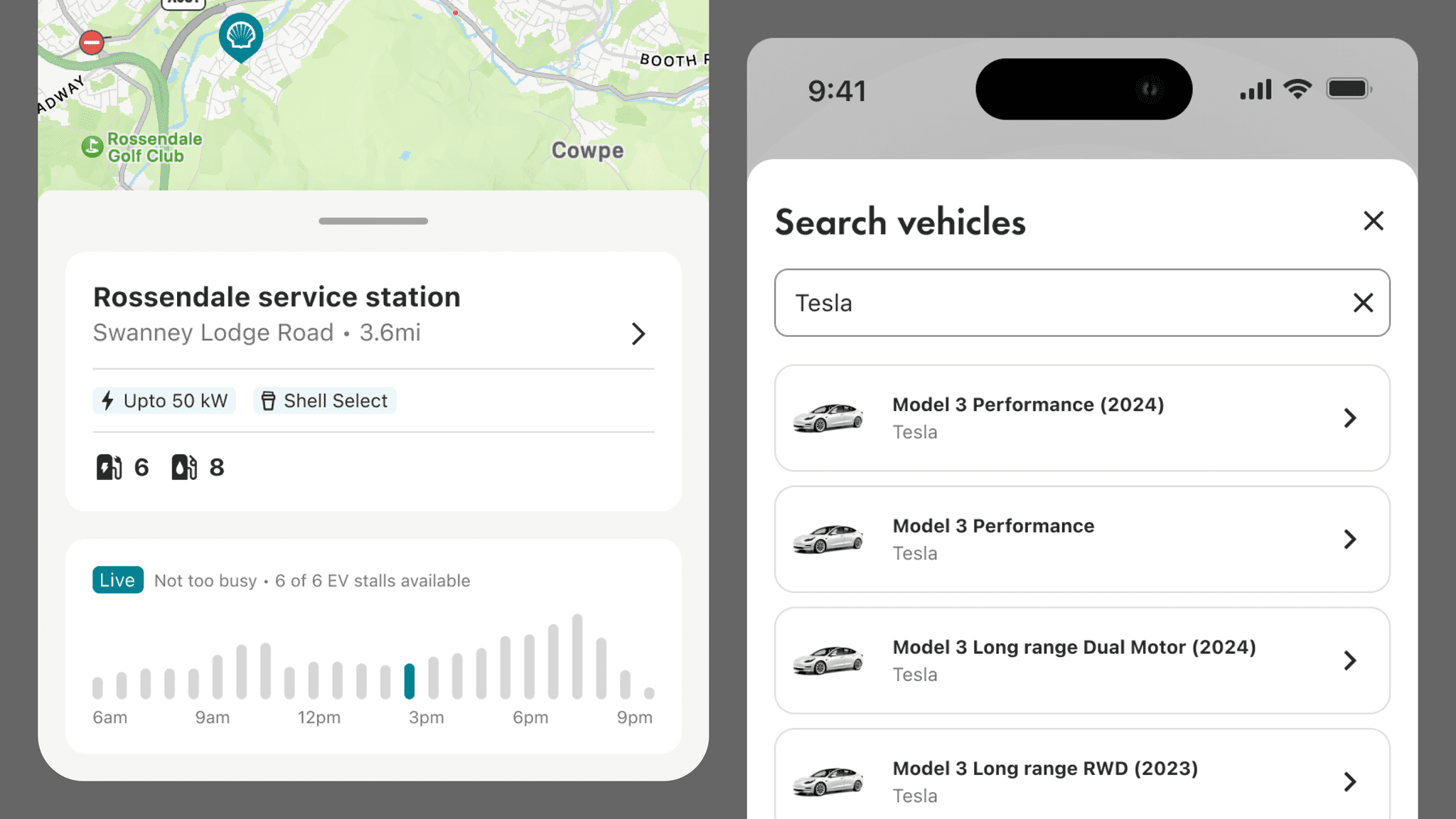
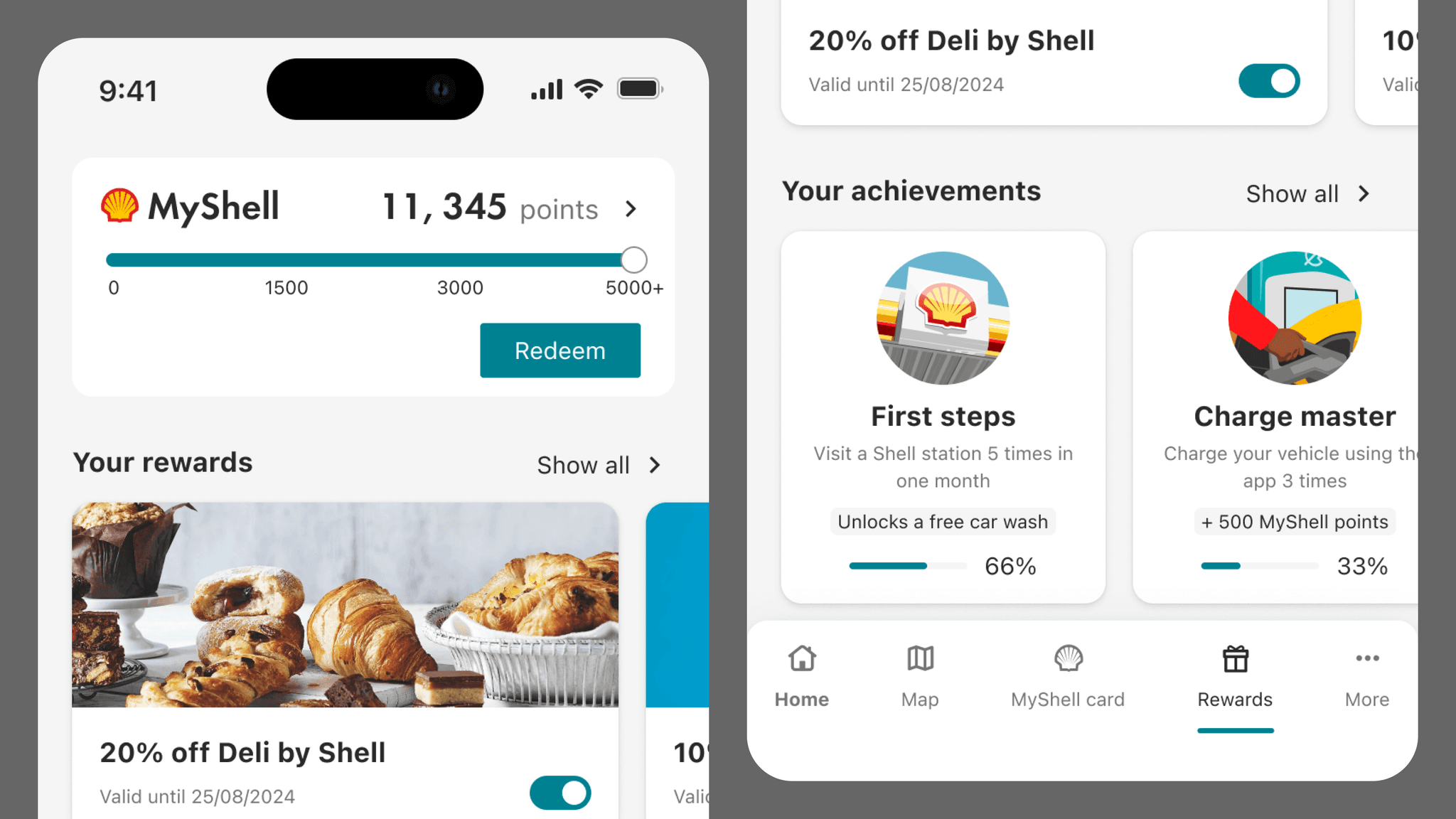
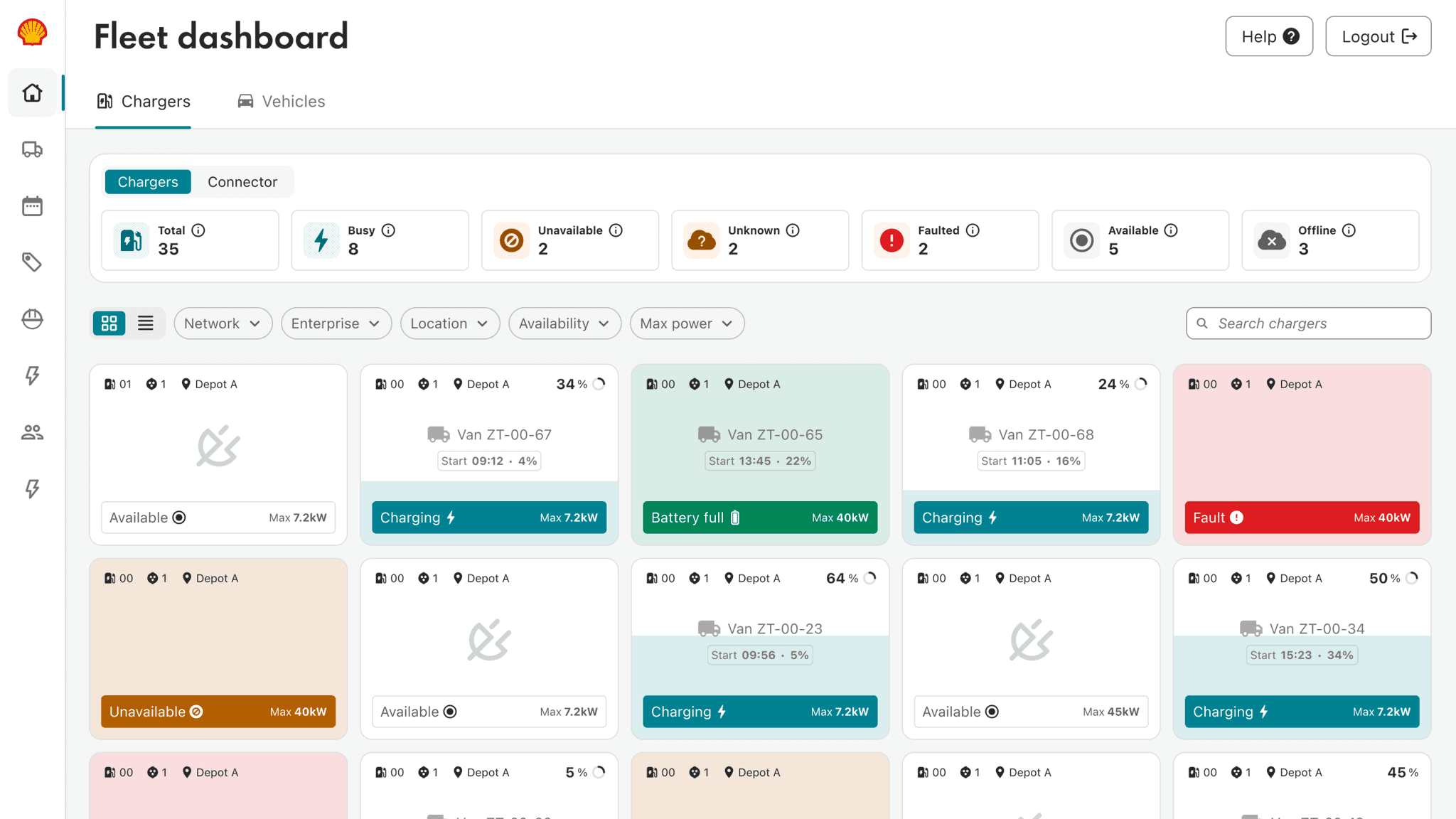
A few examples of products that have utilized the design system include websites, web apps, native apps, email templates, and illustrations. With numerous products at Shell leveraging the Shell Design System (SDS) to accelerate their development, it is estimated that the cost savings to the broader business exceed $2.5-3 million annually.
Collaboration
I feel incredibly fortunate to have contributed to such a significant project for a major organization like Shell. The Shell Design System team consists of some of the most talented and creative individuals I've had the pleasure of working with in my career. They have not only been a constant source of inspiration but have also pushed my skills in ways I never thought possible.
While these are the core members, many others from the Shell Experience Design community have also played a vital role in shaping the Shell Design System into what it is today.
Experience Design Lead
Joel Gill
Product owners
Jordan Hughes, Billy Stagg
Design
Leo Gill, Pelumi Igun, Ben Jones
Development
Francisco Antunes, Jean Barriere, Adrian Blanco, Martin Dawson, Vitalii Maslianok, Anna Wyroba
Content design
Mohita Adhvaryu, Pragya Alagh, Zöe Ward,
Accessibility
